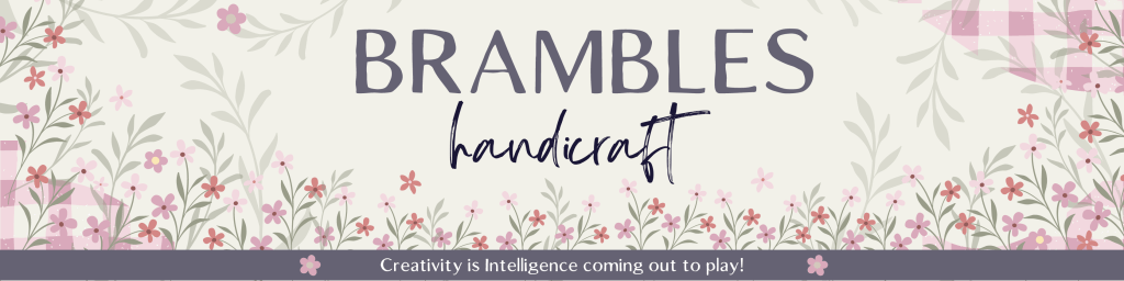
Crafting a Visual Identity: My Personal Brand Process
When I started Brambles Handicraft, an online shop for handcrafted items, I knew I wanted a brand that felt like home—cozy, earthy, and just a little enchanted. But getting from a feeling to a visual identity takes more than picking pretty colors. It requires clarity, intention, and a little storytelling magic.
In this post, I’m sharing the step-by-step process I used to create my brand board, inspired by a branding course I took and adapted to reflect my own experience as a marketer and maker.
🪞 Step 1: Define Your Brand Personality
Before jumping into colors or logos, I took time to define the core attributes of my brand. I asked myself:
Who am I doing this for? (For Brambles, the answer was: me—and anyone who finds comfort in slow, intentional living.)
What feelings do I want the brand to evoke?
What adjectives describe my brand voice?
For Brambles, I landed on: gentle, practical, nostalgic, and a touch whimsical.
🧵 Step 2: Identify a Core Concept or Theme
This was a huge turning point. Instead of thinking in terms of “styles” or “trends,” I focused on a central concept to unify the brand. For Brambles, the theme became:
“Cozy cottage tucked at the edge of a forest. Threads of memory, scent of wild plum, a mended quilt draped over a chair.”
This concept informed everything that followed—from my photography style to my product naming conventions.
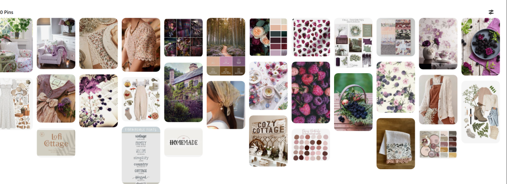
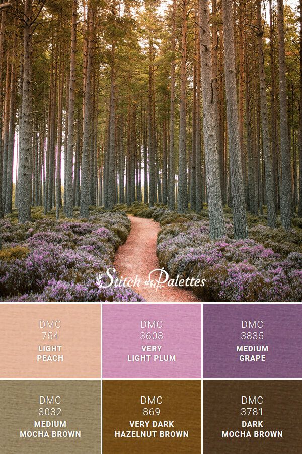
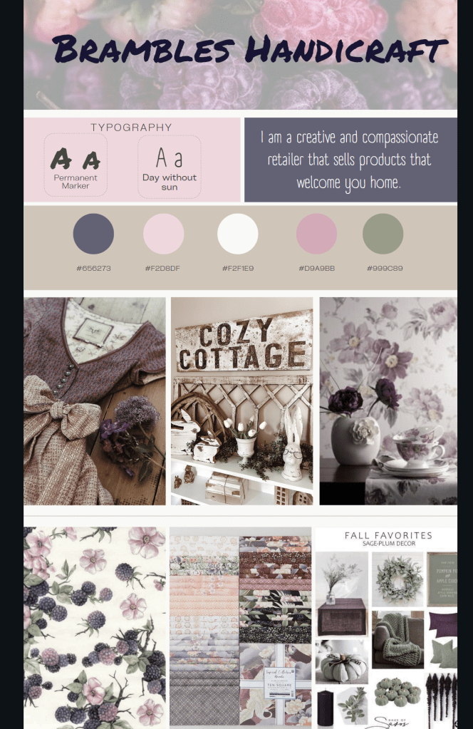
🖼 Step 3: Create a Mood Board
I curated images that captured the feeling of the brand. I focused on:
Color tones (plum, moss, cream, rust)
Textures (linen, woodgrain, pressed flowers)
Lifestyle elements (writing desks, garden paths, handmade objects)
Mood board:
Pinterest became my visual playground—but I made sure each pin connected back to the original concept and brand personality.
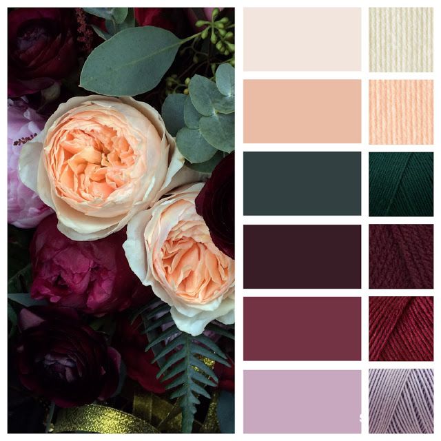
🎨 Step 4: Build a Color Palette
Using Adobe Color, I extracted the most consistent hues from my mood board and finalized a 5-color palette:
Soft Plum
Moss Green
Cream
Weathered Rose
Antique Gold
These colors became the anchors for everything—packaging, tags, and even my Spoonflower listings.
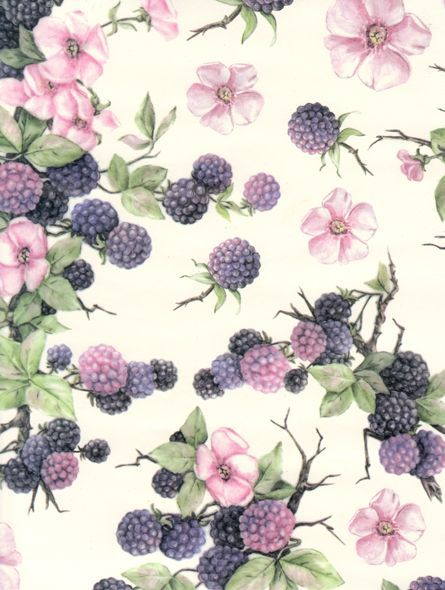
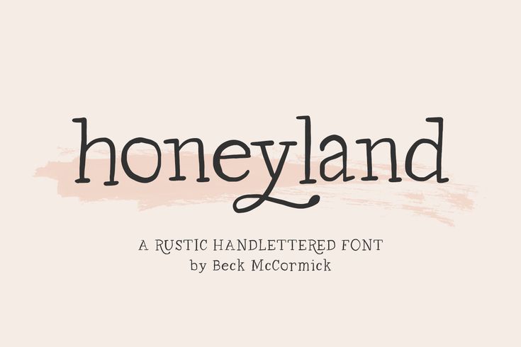
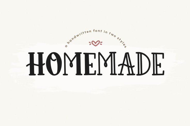
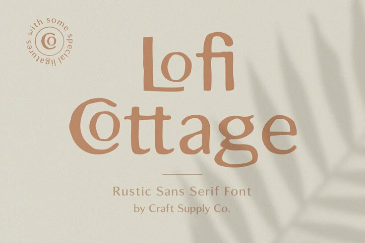
🔠 Step 5: Choose Fonts & Visual Elements
I wanted fonts that felt timeless and quietly handmade. I paired a serif header font with a soft, rounded sans-serif for body text, and added subtle design motifs like stitches, leaves, and wax seals as secondary brand elements.
✨ Final Thoughts
Your brand is more than a logo—it’s the story you’re telling, the emotion you’re evoking, and the invitation you’re extending. Whether you’re a maker, a service provider, or a storyteller like me, building a brand with intention ensures everything else flows more naturally.